The only thing that's kept me going is the steady stream of new kits being revealed, something I've kept on top of thanks to Football-Shirts.co.uk. Now, the issue of new home, away, 3rd, and sometimes even 4th (not to mention European home and away) kits being replaced every season is a rant in itself, and one I won't get into for now.
Because I wanted to focus on the kits themselves. If you sift through the standard, bland and oft-recycled Nike and Adidas templates, and try to kid yourself that Umbro's featureless 'Tailored' range isn't just them running out of ideas rather than the PR excuse of wanting to celebrate [insert team name here]'s proud heritage, there's actually some cracking designs knocking around.

Wycombe's offering, in particular, is a belter, as Kappa show that you can actually do something interesting with a fairly restricting template of two-tone blue quarters, with their wobbly (and, let's be honest, comedy breasts lookalike) chest panels giving the shirt an nice little feature. That said, it does suffer from the age-old Kappa issues of a sponsor that's far too high, and those damn shoulder logos.
But where's the fun in looking at nice shirts? Like a club just before closing time, there's some absolute munters hanging around trying desperately to grab somebody's attention. And what better place to start than at the top of club football?

Grim. I've seen someone wearing this shirt around town (Preston must have a fledgling Catalan population) and it looks just as bad in real life. I can appreciate that Nike want to do something interesting and different with one of its biggest clients, but this? Really? When have asymmetrical stripes EVER looked good? In fact, I'm reminded of this:

 Still, it could be worse. You could be a Gillingham fan, stuck with wearing this. At least it's only a third shirt, so hopefully for Gills' sake they won't have to look at it too often. And just in case you were wondering, the shorts are pink, too.
But before I go, spare a thought for goalkeepers. You'd think they'd be fairly safe from the atrocities afflicting their outfield team-mates, after all, shouldn't they just be stuck in a plain green shirt and left to it? Not if you're the England goalkeeper!
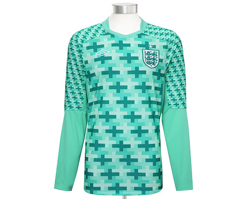
This is, quite possibly, the worst kit of any sort I've seen since, well, England's away goalkeeper kit from Euro 96. What, you don't remember? Well let me refresh your memory...
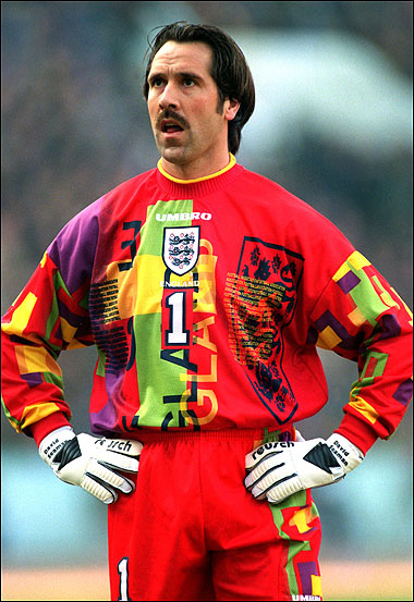
It looks like a parrot was sick on a rainbow. I remember laughing about this kit when I was 8 in the playground. It was even worse when it was what Seaman was wearing in that heart-wrenching shooting against the Germans. And now that memory has made me cry, I think it's an appropriate time to go.
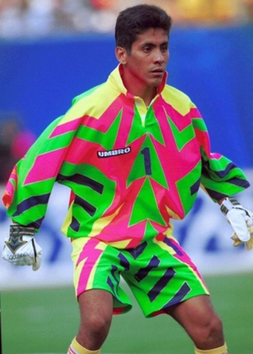
But hang on. How can I possibly write a blog about bad football shirts, and even go so far as to mention goalkeepers, without this fella getting in on the action. Jorge Campos, we at Half Time Oranges salute you!
No comments:
Post a Comment